Interface
Before starting your first analysis, take a moment to explore the elements of the graphical user interface.
Workflow bar
The elements in the workflow bar at the top of the screen help you navigate through the workflow and give access to application-wide options.

- Click the Project icon to create a new project, open an existing project or view the project properties. You can also generate a PDF report and an audit trail, or export your project, project data and project images. For project data, 2D views, 3D views, the Display area and the application window this means that they can be saved to file, printed and copied to the clipboard.
- Navigate back and forth between the workflow steps using the Next and Back arrows. Alternatively, you can directly switch to a workflow step by clicking on it. Only workflow steps in blue are enabled (clickable). Workflow steps that are not yet enabled are displayed in gray.
- Click the Close project icon to close the current project and return to the Project screen, where you can create, manage and open projects.
- Click the Help icon to display brief contextual help about the current screen. The help message provides a link to more complete documentation on our website, or – if you work off-line – a locally installed copy.
- Click the Options icon to access the General options (applicable to the entire application) and Workflow options (applicable for certain workflow steps).
- Click the Image view icon to switch to Image view mode, accessible from all workflow steps. This mode offers more flexible image visualization, allowing you to select specific images to view and display the Gel table or Spot table for those images only. You can also access the Multichannel color overlay feature in this mode.
Workflow
The various steps of the analysis are summarized below.
| Quality control | 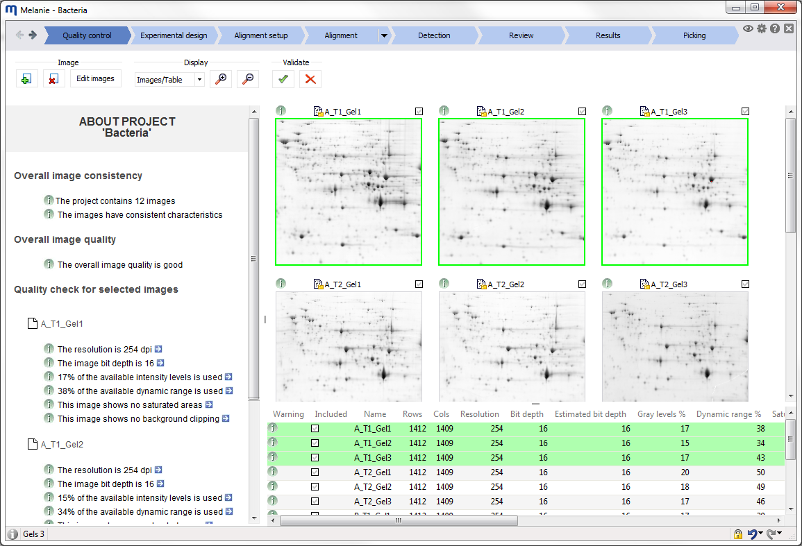 |
Check the quality and consistency of your images. Melanie provides the necessary feedback to optimize your image capture procedures. Potential issues are highlighted and information provided on how to solve them. When required, re-scan gels or edit images. Then validate the images you want to take forward for further analysis. |
| Experimental design | 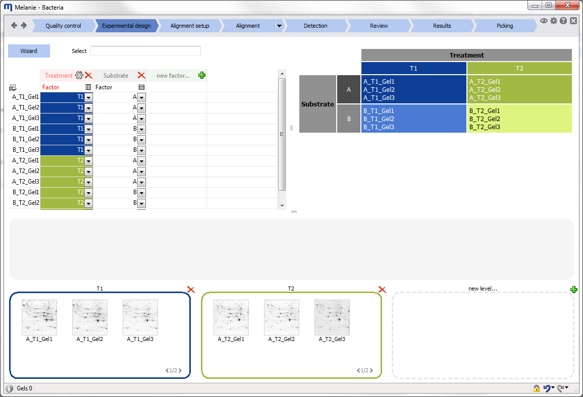 |
Define the experimental design variables. Use the Experimental design wizard to create one of the common designs, name factors and factor levels, and assign images to the different treatments. Specify additional experimental variables that you might want to investigate, and verify if you have a consistent and balanced experimental design matrix. |
| Alignment setup | 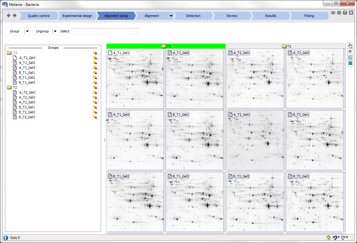 |
Specify your alignment strategy. To increase alignment efficiency and minimize match editing work, you can first align images within groups of similar images. The different groups are further matched by aligning their respective reference images. Group your images based on factors defined in your Experimental design, or build your own group hierarchy. Then specify the reference images and reference groups for alignment. |
| Alignment | 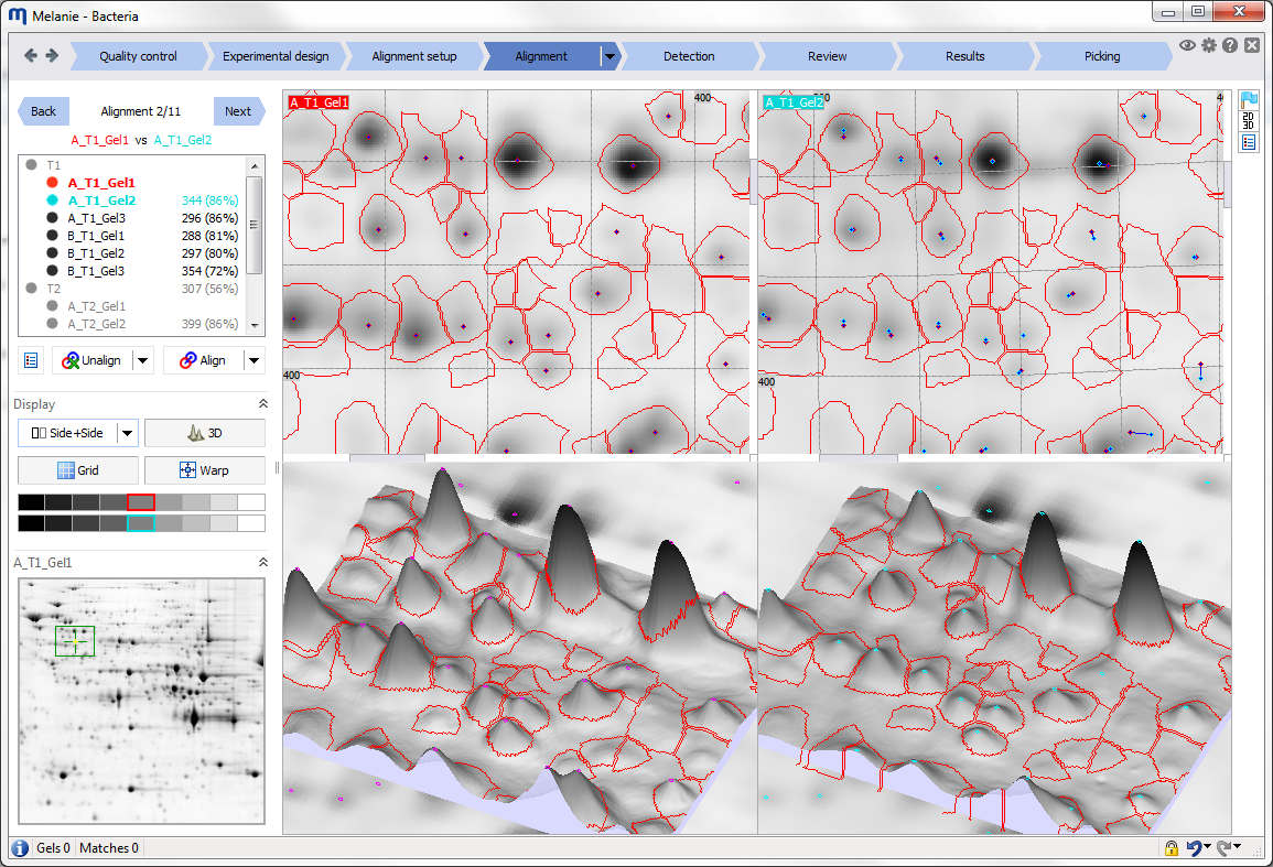 |
Align images to remove positional variation between gels. Align the images in your alignment hierarchy, systematically review each alignment pair using the dedicated tools, and edit matches where necessary. |
| Detection | 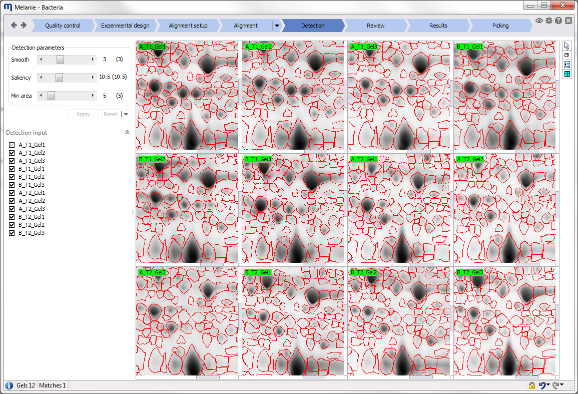 |
Detect and quantify spots on all images. Fine-tune the automatically calculated detection parameters and choose the images to be taken into account for the generation of a representative spot pattern. |
| Review | 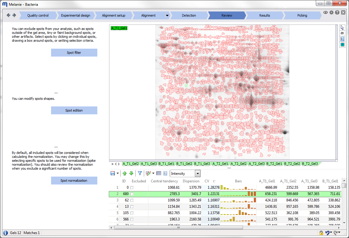 |
Review spots and normalization. Review the spot pattern, possibly editing spots or making corrections in the alignment. Select spots using the advanced selection criteria in the spot filter, to include or exclude them from further analysis. Review the normalization before continuing with the statistical analysis. |
| Results | 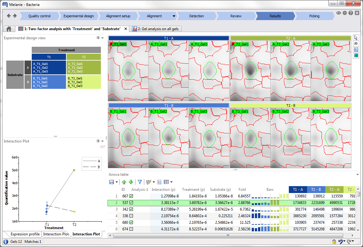 |
Explore your results. Melanie automatically proposes dedicated tools and statistical tests adapted to your experimental design. Filter your spots based on selected fields in your tables, tag them using spot sets, and validate spots by using the various plots and viewing options. |
| Picking | 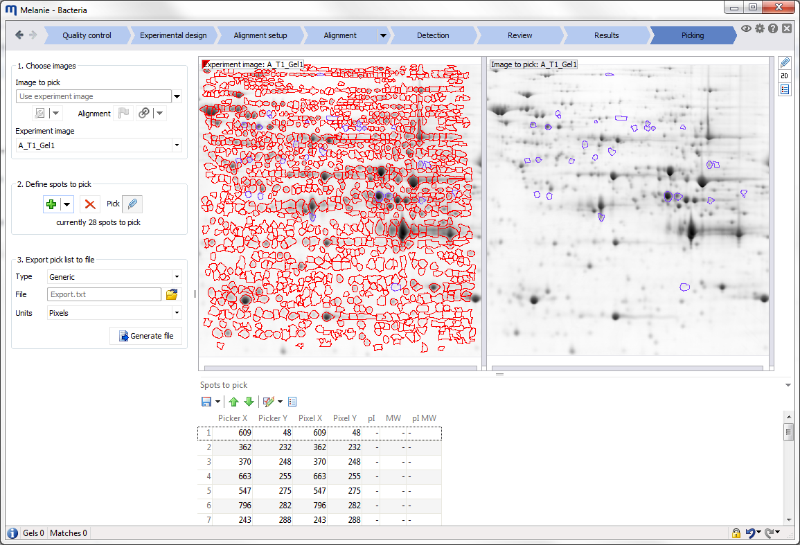 |
Choose and export spots for picking. Pick spots for picking and further downstream analysis. |
Display area
The Display area is where the image views are shown. You can manipulate and customize these views using the different options in the Toolbar at the right of the Display area.
Toolbar
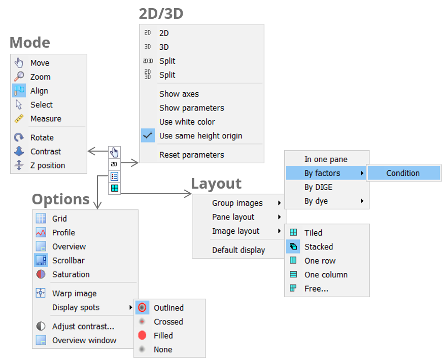
Mode
The Mode icon lets you pick the desired tool for manipulating your images. You can work in Move, Zoom, Select, Measure, Align, Pick or Edit pI/MW mode. Some modes are not available in all workflow steps.
There are a number of common manipulations that you can carry out with all of the modes, essentially using the scroll wheel of your mouse. This avoids frequent mode changes to move, zoom and rotate images or increase peak height in 3D view. You will appreciate the simplicity and time savings of using the scroll wheel for the following operations:
2D view 3D view Move image Hold down scroll wheel and drag.
Double-click scroll wheel to re-center on an area.Ctrl + Hold down scroll wheel and drag. Zoom image Roll scroll wheel. Roll scroll wheel. Rotate image – Hold down scroll wheel and drag. Set peak height – Ctrl + Roll scroll wheel. Note how all images move/zoom/rotate simultaneously once images are aligned. To manipulate only one image at a time, hold the Shift key while carrying out the desired operation. To synchronize your image views again, zoom in or out on your image without the Shift key, or double-click the mouse scroll wheel.
Choosing a different mode will allow additional manipulations with the left and right mouse clicks. These are summarized in the following tables.
| 2D view | 3D view | |
| Move image | Left-click and drag. Double-click left button to re-center on an area. |
Left-click and drag. |
| Set peak height | – | Hold down right button and drag up/down. |
| 2D view | 3D view | |
| Zoom image | Left-click to zoom in. Right-click to zoom out. |
Left-click to zoom in. Right-click to zoom out. |
| 2D view | 3D view | |
| Select spots | Left-click on spot to select. Right-click on spot to deselect. Left-click and drag to select spots in area. Right-click and drag to deselect spots in area. Right-click in background to deselect all. |
Left-click on spot to select. Right-click on spot to deselect. Left-click and drag to select spots in area. Right-click and drag to deselect spots in area. Right-click in background to deselect all. |
| 2D view | 3D view | |
| Measure distances | Left-click and drag to measure horizontal and vertical distances. | Left-click and drag to measure horizontal and vertical distances. |
| 2D view | 3D view | |
| Select matches | Left-click on match to select. Right-click in background to deselect. |
Left-click on match to select. Right-click in background to deselect. |
| Edit matches | Left-click to create. Left-click on match and drag to move match. Double-click to create. Right-click on match to delete. Right-click and drag to delete matches in area. |
Left-click to create. Left-click on match and drag to move match. Double-click to create. Right-click on match to delete. Right-click and drag to delete matches in area. |
| 2D view | 3D view | |
| Select spots to pick | Left-click on spot to select. Right-click on spot to deselect. Left-click and drag to select spots in area. Right-click and drag to deselect spots in area. |
Left-click on spot to select. Right-click on spot to deselect. Left-click and drag to select spots in area. Right-click and drag to deselect spots in area. |
| 2D view | 3D view | |
| Select marker | Left-click on marker to select. Right-click in background to deselect. |
Left-click on marker base (cross) to select. Right-click in background to deselect. |
| Edit marker | Double-click to create/edit marker. Drag base (disc) to move marker. Right-click and drag to delete markers in area. |
Double-click to create/edit marker. Drag base (cross) to move marker. Right-click and drag to delete markers in area. |
A few modes are only active on the 3D view:
- Rotate – Left-click and drag to rotate.
- Contrast – Left-click and drag up/down to change peak height.
- Z position – Left-click and drag up/down to move the entire 3D view vertically.
2D/3D
Click the 2D/3D icon to choose different combinations of 2D and 3D views for your images. If 3D views are included, there will be further options for the display of the 3D view.
NOTE
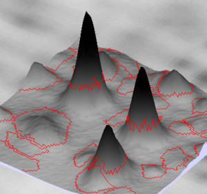
By default, areas not visible in the 2D view are shown with an image background in the 3D view. To display the 3D view with a white background instead (see illustration), go to the Display tab in the General options and untick Display image background in 3D View.


Options
Various tools and options are available to adapt the default views to specific needs.
- Grid – Display a grid over the images in the 2D view. In combination with the Warp option, the grid helps you visualize the deformation in your images.
- Profile – The profile helps explore spot shapes in the 2D view. When this option is activated, transparent curves represent the intensity variations of the gel in the vertical (right) and horizontal (bottom) directions at the position of the mouse cursor. White lines indicate the exact position of the cursor, with the corresponding pixel gray level in red. The gray numbers indicate the minimum and maximum gray levels in a specific profile view.
- Overview – Show the currently visible area on a small overview of the entire image.
- Scrollbar – Show or hide the scrollbars.
- Saturation – Show areas in the images that are saturated. Saturation helps explain why some spots are detected in a certain way. It also highlights spots for which abundance values cannot be accurately determined.
- Warp image – Warp the aligned image in the 2D and 3D views so it superimposes perfectly with the reference image.
- Display spots – Choose how your spots should show (Outlined, Crossed, Filled, None)
- Adjust contrast – Adjust the contrast of images.
- Overview window – Display a separate window to show the currently visible area on an overview of the entire image.
Layout
Depending on the workflow step, related images are grouped in containers that are called panes. Click the Layout icon to group your images differently, change the layout of the panes in the Display area, or the layout of your images in the panes. Note that some of the options are not available in all workflow steps.
- Group images
- In one pane – All images are displayed in a single pane.
- By factors – Images from the same factor level are grouped within a pane.
- By alignment – Images from the same alignment group are grouped within a pane.
- By DIGE – Images from the same DIGE gel are grouped within a pane (only for DIGE experiments).
- By dye – Images using the same Cydye are grouped within a pane (only for DIGE experiments).
- Pane layout and Image layout
- Stacked – Panes/images are one on top of another.
- Tiled – Panes/images are side by side.
- One row – Panes/images are in a single horizontal row.
- One column – Panes/images are in a single vertical column.
- Free – You specify the number of panes/images laid out horizontally and vertically.
Image view
Normally, the Display area shows all images in your project or analysis. To hide specific images, you could adjust the layout settings of panes or images. However, the software provides a simpler option. At any time, you can click the Image view icon located in the top right corner of the software window to switch to Image view mode. This mode allows you to select, and focus on, a subset of your images for a more detailed visual examination.
Image selection
In Image view mode, you can select a subset of images from the groupings in the left panel—either Gels, Alignment setup or Experimental design. This selection will ensure that only the chosen images appear in the Display area, unlike other screens where all images are shown.

Views and tables

At the top of the Image view screen, you’ll find shortcuts to several display options, including Grid, Profile and Overview. You can also use the Multichannel button to activate the Multichannel color overlay. This feature allows you to layer multiple images in different colors, highlighting protein expression variations.
Click the Gel table or Spot table buttons to examine data specific to the selected images.
Multichannel color overlay

The Multichannel color overlay offers a visually intuitive way to illustrate differences and similarities in protein expression, making it a popular choice for scientific papers, presentations, and posters. Here’s how to create your custom multichannel view:

Choose the number of channels
Color overlays can be created for up to three images, or you can generate a grayscale composite for any number of selected images. Click the Channels button to choose one of the available options:
- One channel – Apply color to a single image.
- Two channels – Overlay colors for two images.
- Three channels – Overlay colors for three images.
- All images – Create a grayscale composite for any number of selected images.
Select the color scheme
Click the Colors button to select your preferred color scheme. The available options will depend on the number of channels selected.
Assign an image to each channel
For each channel, use the dropdown menu to assign an image to that color.
Adjust the contrast for each channel
Enhance a channel’s visibility by adjusting their contrast. Click Adjust Contrast to open a panel on the right, featuring a horizontal slider and vertical bending parameter for contrast adjustments. Change the selected image in the Contrast dropdown to adjust another image’s contrast.
Invert the color scheme
By default, spots appear colored against a black background. Click Invert to display them as black on a colored background.
Warp the images
The Multichannel color overlay can be created for any aligned images, not just for images from the same gel or blot. Ensure images are precisely aligned before toggling the Warp button to switch between warped and unwarped states.
Export the Multichannel color overlay
You can export your color overlay in various formats (.png, .jpg, .bmp, .tif), print it, or copy it to the clipboard. Select the Multichannel pane, navigate to the Project icon in the top left corner of the software window, select Export > Image > 2D, and follow the prompts. When asked to select the image to export, choose Overlay and click OK.
Status bar
The status bar gives access to some useful tools.

- Click the Cursor information icon to display the Cursor information window. It displays information about the pixel and spot you hover over with your mouse cursor. You can show additional properties or hide some of them by clicking the Options icon in the Cursor information title bar.
- The Status bar indicates the number of gel images and spots that are currently selected. When you hover over the Gels information you can see the total number of images in the analysis. Similarly, hovering over Spots shows the total number of spots and the number of disabled spots. If you move your mouse over a gel image, the Status bar also indicates the X and Y coordinates at the cursor position, as well as the pixel intensity (calibrated). The unit of the coordinates can be changed in the Display tab of the General options. If pI and/or MW calibration was performed, the Status bar further shows the computed pI and MW values at the cursor position.
- Click directly on the Undo or Redo icon to undo (or redo) the last operation. Click on the arrow next to the icon to get access to the list of all operations that can be undone/redone.
- Click the Save icon to:
- Save modifications – Save all modifications carried out in the current workflow step, since the last save operation.
- Reset modifications – Cancel all modifications carried out in the current workflow step, since the last save operation.
- The Project lock icon tells you whether your project is locked for editing. Projects get locked once the images are aligned and detected. Editing them in any way will require you to confirm that you effectively want to carry out the requested operation and are aware that this will make you loose your results (validations, or even alignment, detection or normalization, depending on the step where you want to make a change).
Step-specific tools
The step-specific tools and views are mostly displayed at the top and/or left side of the software screen. They will be specifically documented in the sections of the User Guide corresponding to each workflow step. Several of the step-specific tools are reports, for which the common features are described below.
Reports
Reports describe your analysis data. They may be in table format, but can also be graphical representations of data such as normalization plots, expression profiles or PCA plots. The report content is continuously updated, and selections in reports are synchronized with the gel images and other reports.
The reports in Melanie share a large range of common functionality.
Report options
At the right of each report title, you will see the Options icon. Depending on the report, you will find options here to export your report, change column settings for tables, modify display settings for plots or histograms or set the size of 2D or 3D images included in the report.
Export
 Save to file
Click Save to file to save tables in tab-delimited Text format (.txt), in PDF format (.pdf), as Excel Workbook file (.xlsx), as HTML (Web document) (.html) or in XML format (.xml). Graphics can be saved in PNG, JPG, BMP or TIFF formats.
 Print
Print
Click the Print icon to print the report. Melanie shows a Print Preview where you can change options (layout, include/exclude background colors, headers/footers) before printing.
 Copy to clipboard
Choose Copy to clipboard to export your data into another application. Paste directly into the preferred software.
Export options for tables
Whether you save your table to file, print it or copy it to the clipboard, the export options allow you to tweak the output:
- Rows – Specify if you want to export all rows or only selected rows.
- Columns – Choose if you want to export all columns, visible columns or a specified subset of columns.
- Description – Indicate if the output should contain information about the report.
- Extended headers – Tick this option if you want to include information about the factor level(s) to which each image belongs.
- Cell colors – Tick this box if the colors of the cells as they appear in the table should be exported as well.
Column settings
 Column settings
Click the Column settings icon to set the visibility and order of your columns. In the toolbar of the Column settings window, you can Load a predefined template or Save your own template indicating what columns should be hidden or shown.
Display
The availabe display options are mostly proper to the specific plot or histogram and are described in the section describing the report.
Image size
If you chose to display All images or All 3D images in reports via the Column settings, you can adjust their size as Small, Medium or Large by going to the report’s Options icon and selecting Image size.
Report toolbar
The toolbars of the reports in Melanie share a series of common tools.
 /
/ Previous and Next selection
Click the Previous Selection icon to skip to the first selected item encountered when scrolling towards the top of your table. When only one row is selected, this selects the previous row in the table.
Click the Next Selection icon to skip to the first selected item encountered when scrolling towards the bottom of your table. When only one row is selected, this selects the next row in the table.
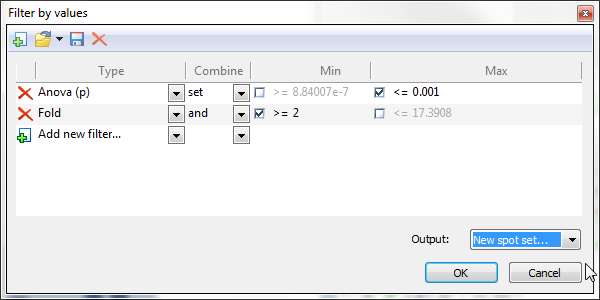
 Filter by values
Select items in the report based on one or several numerical filter criteria. Click the Filter by values icon, choose the measure (i.e., column) you want to use for refinement, and set the lower and/or upper limits of your search interval. When you add additional criteria, you can specify the operator used to combine the criteria.
For some tables, Filter by values proposes default filter criteria. This is notably the case for the Anova table in Results where the ANOVA p-value limits used in Filter by values are based on the pre-defined Significance level. You can set this parameter in the Quantification tab of the General options.
You can create, save, load and delete your own filters by using the icons in the toolbar of the Filter by values window.
Choose the output for your filter as being the new Current selection, a New spot set, or one of the existing spots sets.
 Annotate
Melanie provides two ways to annotate interesting spots in your analyses:
- The first one is by creating a collection of spots that belong together based on a specific criterion. Such a collection of spots is called a spot set. For instance, you can create a spot set ‘Fold>2’ for all spots that have a Fold change higher than 2. This means that all spots in the set are tagged as belonging to the spot set ‘Fold>2’.
- The second option is to label spots individually with an annotation. Annotating a spot means that you give it a specific label that belongs to a certain category. For instance, you can annotate each protein spot with it’s accession code in a protein database. Every protein spot will have a specific label – in this case an accession code (e.g. P12345) – within a category ‘Ac’ for instance.
Spot set
It is possible to focus your analysis on particular spots by creating and saving spot sets for later selection or combination. Spots sets are visualized as columns in various tables. Once a spot set is created, you will see a checked box for spots that belong to the set, or an empty box for spots that do not belong to the set. Click in a box to change its state. If several spots are selected, clicking in one box will change the state for all selected spots.
Hover over the name (column header) of a spot set to see a tooltip with information about the set: how it was created, and based on what criteria. If the set has been modified since its creation (for sets created from Combine spots sets), or if the data used for its creation has been modified (for sets created from Filter by values), this will be indicated as well.
Click the Spot Set option under the Annotate icon to create, combine and manage new spot sets:
- Create – Select spots you want to include in a spot set, either manually or by selection in a report, and then choose Create.
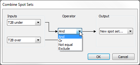
- Combine – You can combine two spot sets using logical operators. Four operations are available:
- And – Keeps spots that belong to both spot sets.
- Or – Keeps spots that belong to either one or both spot sets.
- Not equal – Keeps spots that belong to only one of the two spot sets.
- Exclude – Keeps spots that belong to the first spot set and do not belong to the second spot set.
- Delete – Delete a spot set.
- Rename – Rename a spot set.
- Select – Select all spots in a spot set.
Annotation
You can annotate selected spots by assigning a label within a specific category. Each annotation category is represented as a column in various tables, with the labels appearing as values in the cells of such columns. To edit a label once the category has been created, simply double-click a cell under the appropriate annotation category.
To create and manage annotations and their categories, click the Annotation option under the Annotate icon:
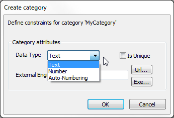
- Add/edit label – Click this to create a new label or modify existing ones. You will be prompted to specify a category for the label. Choose an existing category from the list or enter a new category name. Define the constraints for the new category:
- Data Type – Ensure consistency in annotation data by selecting a data type for the label:
- Text – Accepts any characters.
- Number – Restricts content to numerical values.
- Auto-Numbering – Automatically assigns an incremental number as the new label.
- Is unique – Check this box if each label within the category on a gel must be unique. The software will reject a new label if an identical one already exists.
- External engine – Link spot annotations to protein data in 2-DE or other databases by setting the database address and query engine in the External Engine field of the label category. If you input valid database accession numbers as labels, clicking such a label (while holding the Ctrl key) will launch an HTTP query in your default browser using the URL format entered. For example, entering ‘https://www.uniprot.org/uniprotkb/’ in the External Engine field and annotating a spot with the label ‘P05067’ will open ‘https://www.uniprot.org/uniprotkb/P05067’.
- Data Type – Ensure consistency in annotation data by selecting a data type for the label:
If the External Engine field is left empty, alternative linking options are available when creating your label. In the Create label for category window, just change the option in the drop down at the bottom of the window:
-
- Only label – The label will not link to any external data.
- Additional text – Add extra textual information below the dropdown. This text will display when you hover over the label in your table.
- URL – Enter a URL below the dropdown. Clicking the label (while holding the Ctrl key) will open the web page in your default browser.
- File – Link a file saved in your Annotation linked-file folder by entering its name below the dropdown. Clicking the label (while holding the Ctrl key) will open the file with the default system application for that file type.

- Delete label – Click Delete label to delete the labels for selected spots.
- Rename category – Click Rename category to rename a category that you can specify in a list.
- Delete category – Click Delete category to delete categories that you can specify in a list.
- Select by category – Select all spots that have labels belonging to one or several categories.
- Select by content – Select all spots for which the labels, in the specified categories, contain a specific search word or character pattern.
- Import – Import annotations from a tab-delimited text file or XML file containing the required columns ID, Pixel X, Pixel Y, pI and MW. If values for ID are entered, the Pixel X and Pixel Y values can contain ‘-1’ if the coordinates are unknown, and vice versa.
 Tables
Click on the Tables icon to display complementary reports. The new report will generally appear on top of your existing report. You can click on the tabs at the bottom of the table to switch between reports. Click on the small cross at the top right of a complementary report to close it.
Settings
The Settings icon gives access to the Column settings and tools related to the display and analysis of column content. These options are also available when right-clicking a column header.
Best fit / Best fit all
Choose Best fit to adjust the width of the current column so that all the information in the column shows. The option Best fit all adapts the width of all columns.
Show group by
Click Show group by to group rows according to their values in the column. This is only useful when you have several items with the same value, such as the image Name or spot ID in a Spot table. In the example below, spots are grouped by ID. Right-click the isolated column header in the gray area and choose Hide group by to return to the default table format.

Show cumulative histogram
Choose Show cumulative histogram to display a histogram of the values in a selected column. You can choose the type of histogram (Histogram, Cumulative histogram, Inverse cumulative histogram or Symmetric cumulative histogram) and show or hide the Mean and Median values on the graph. Simply click the Options icon at the top right of the Cumulative histogram window and choose Display.
Change the column used for the plot from the drop down on its X-axis. Alternatively, you can click the column display box in the toolbar of the report from which you created the plot. Clicking the red cross on this box will close the Cumulative histogram window.
The figure below shows the cumulative histogram for the coefficient of variation (CV). When hovering over the plot, you can read the percent of values that have a CV below (or above, for some histograms) the value under the cursor. In the example, about 74.35% of spots have a CV lower than 0.505656.
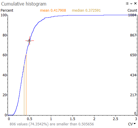
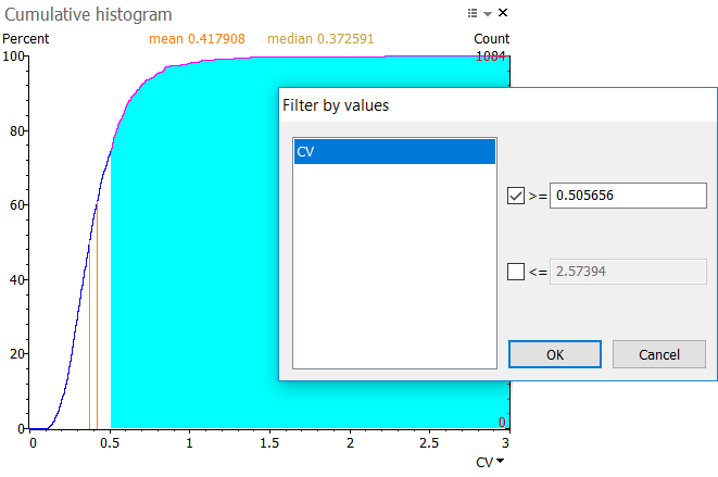
Click and drag to select a range of values in the histogram. The range is shown in blue. When you release your mouse button, a Filter by values window will display. Click Yes to apply the pre-filled thresholds. This selects the spots in the corresponding value range on your images and in the reports.
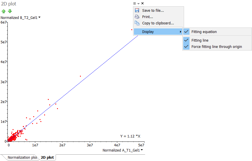
Show 2D plot for columns
Select the Show 2D plot for columns option to plot the values of two variables (columns) along two axes. The resulting 2D plot can reveal any correlation present. If the correlation is linear, you can click the Options icon at the top right of the 2D plot window and choose to Display:
- Fitting line – Show the linear regression line through the data points.
- Fitting equation – Display the equation for the linear regression line through the data points.
- Force fitting line through origin – Force the linear regression line to go through the origin.
Change the columns used for the plot from the drop down menus on their axes. You can also click the column display box in the toolbar of the report from which you created the 2D plot. Clicking the red cross on this box will close the 2D plot window.
You can for instance display a 2D plot of the normalized spot volumes in the Normalization table and show the fitting line and equation (forcing the line to go through the origin). The slope of this linear regression corresponds to the Fitting value that can be found in the Normalization factor table.
Select
Choose the Select option to easily select all checked or unchecked spots in a spot set.
Display values
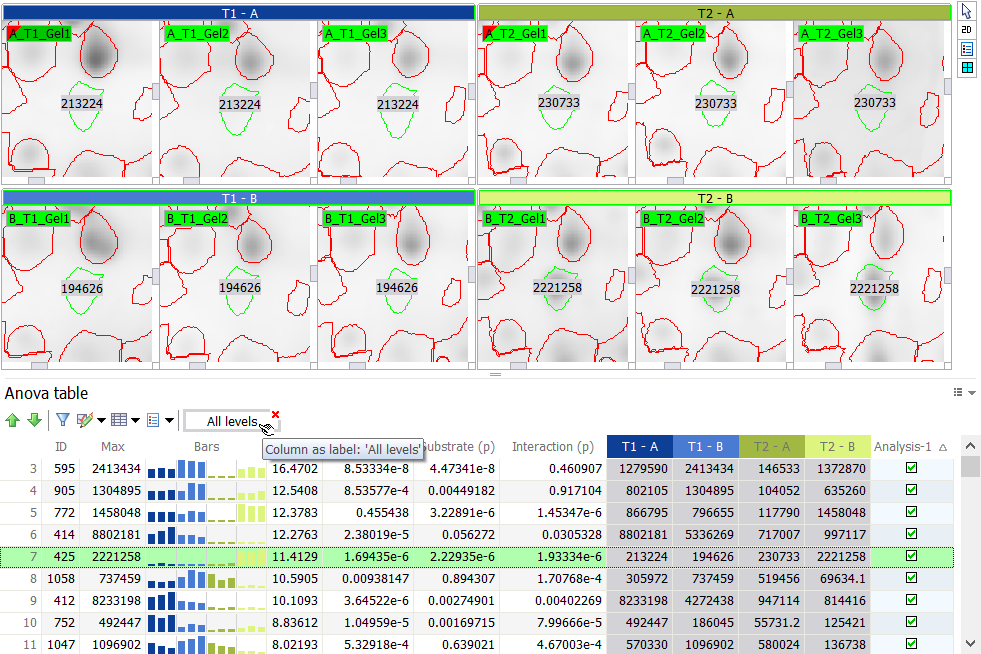
Values in a column, including those from annotations and spot sets, can be displayed on the images as labels or colors.
It is important to note that some columns are special, as they are linked to other columns. For instance, in the Group table, there is a spot abundance column for each image. In the report’s Column settings, you cannot hide or show each of these columns separately. You can only hide or show all the columns at the same time, by unticking or ticking the All gels box. Other examples of such linked columns are the treatment conditions in the Anova table or in the Expression ratio table.
When you want to Display values from linked columns as labels or colors, you can choose to:
- Select a named column ([ImageName]/[LevelName]) – This will display the values from the selected column on all other images. As a result, all images will display the same label or color for a given spot.
- Select all linked columns (All gels/All levels) – This will label or color the spots on each image with the values from their corresponding column. In other words, for a given spot, each image will display the value for the particular image.
When you select a column that is not part of a column group (such as ID, Mean or Fold), the second option will not be proposed.
Show label
Choose Display values and then pick one of the Show label options to display column content as labels on the 2D view. These options are not avaible if only 3D views are displayed.
- Show label on all spots – Choose this option to show a label on all spots.
- Show label for selected spots (adaptive) – Choose this option to show a label on selected spots only. For instance, when you examine your spots in the Display area and only need the information on the spots of interest.
- Show label on presently selected spots (fix) – Choose this option to show a label on presently selected spots. Once your labels show, you can deselect the spots without the labels disappearing. This is useful when you only want labels on certain spots for publication purposes.
- Hide label – Choose this option to hide all labels.
When labels are displayed, a column display box appears in the report toolbar. You can click on the red cross on that box to remove the labels. You can also click elsewhere on the box to change the label settings.
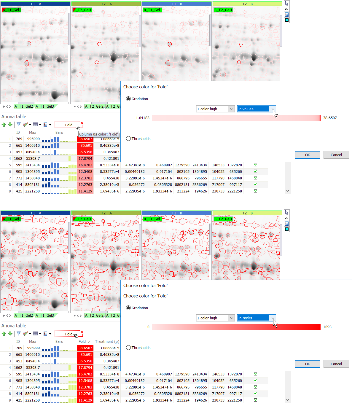
Show color
Select Display values and then choose Show as color or Show ratio as color to apply a desired color coding to the spots on your images and the values in the column(s). Spot color coding is possible based on numerical columns and spot sets. It is not available for annotations.
Melanie offers various possibilities:
- Gradation – Use one of the automatic color gradations.
- Select one of the color options (3 colors, 2 colors, 1 color low, 1 color high).
- To change the default colors, go to the Colors tab in the General options and edit the colors in the Column as spot colors section.
- The color gradations can be based on the:
- values – The color gradations are linearly distributed between the lowest and highest values in the column(s). These extreme values are shown at the left and right of the colored bar.
- ranks – The color gradations are linearly distributed over the ranks of the spots (spots are ranked by value).
- % – The color gradations are linearly distributed over the percent of the spots (spots are ranked by value).
NOTE
The colored bar in the Gradation section shows the proportion of spots having a specific color. It is not a view of the color palette applied. In the illustration below, the majority of spots have a low Fold change. Therefore the values option shows a lot of pink spots and only few red spots (with high fold change). When using the ranks option, the white to red gradation is applied linearly to the value-ranked spots, so many more spots are colored red.
TIP
A two color gradation based on ranks or % can be used to create heatmap-like representations, visually revealing interesting expression patterns, as shown for the Group table below.

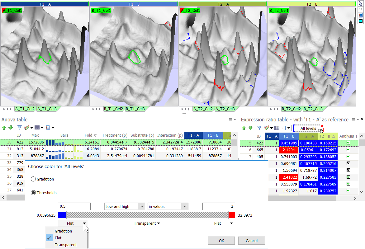
- Thresholds – Set thresholds to color code your spots.
- Choose one of the threshold options (Low and high, Low, High).
- To change the default colors, go to the Colors tab in the General options and edit the colors in the Column as spot colors section.
- Specify one or two thresholds to define different color zones: enter a value in the threshold box(es) or drag the slider(s) between the different sections in the colored bar.
- The thresholds can be entered as:
- values – This is useful when you want to color spots that have a value lower or higher than a specific threshold.
- ranks – This is useful when you want to color a specific number of spots at the low or high value ranges.
- % – This is useful when you want to color a specific percentage of spots at the low or high value ranges.
- For each of the sections, specify the color option:
- Gradation – Apply a color gradient to the spots in the section.
- Flat – Apply a uniform color to all spots in the section.
- Transparent – Make the spot shapes in the section transparent so the spots do not show.
TIP
Use the threshold option in the Expression ratio table to easily color spots that are over- or under-expressed by a certain factor, compared to a reference treatment. In the figure below, spots that are under-expressed compared to treatment T1 – A appear in blue. Spots that are over-expressed show in red. Spots with expression ratios between 0.5 and 2 are transparent.
The software offers a shortcut for this use. For columns that contain ratio data (e.g. Fold, levels in the Expression ratio table), the option Show ratio as color automatically applies default thresholds and color schemes to quickly show which spots are up- or down-regulated by a factor of 2 or more.
When spots are color coded, a column display box appears in the report toolbar. You can click on the red cross on that box to remove the color coding. You can also click elsewhere on the box to change the color settings.
Project report in PDF format
To share your analysis easily or archive all essential project information, you can automatically generate a comprehensive Project report in PDF format that summarizes all essential quality control checks, workflow parameters, results, images, tables and plots in a single document. If desired, a detailed spot measurements report and an audit trail can be generated as referenced appendices. The expression analysis report integrates information from all open analyses (e.g. two-factor analysis, one-factor analysis, PCA), for all or selected spots, with spot details including 2D or 3D views as visible in the software.
To generate the report, click the Project icon at the top left of the screen and choose the option Project report. After specifying a file path and name, you will get the option to save detailed spot measurements and/or an audit trail in separate appendices that will be referenced in your main PDF report. You can change the page setup if necessary.
NOTE
Depending on the number of images and spots included, the creation of the project can take time (1-10 minutes or more). This is the perfect moment to grab a coffee and celebrate the completion of your analysis!
Audit trail
The audit trail documents every user action throughout a project’s lifespan. Each action is recorded in an audit file within the project, complete with timestamps and user IDs. It also captures the action’s critical parameters for replication. You can view the history of actions in the Project audit table and export it in .pdf, .xlsx, .txt, .html, or .xml formats. When exporting the Project report, the audit trail can be included directly in the main report or as a referenced appendix.
To open the audit trail, click the Project icon at the top left of the screen and choose the option Project audit. Use the options at the top of the Project audit table to Export the table, change the column Settings, or Refresh the table.

Export
Melanie offers a range of exporting features so you can easily share your project, save the project’s data or images for further analysis or publishing, print data and images or copy them to the clipboard for use in presentations or written reports. Click the Project icon at the top left of the screen and then choose Export to access these options.

Export the project
Export the Project to save all project-related files into a single compressed file with the extension .pex. Project exports are useful for regular archiving so you can recover your work at any time. They are also convenient to make a project available to colleagues so you can share the results.
Export the project data
Exporting your Data saves, prints or copies (to clipboard) a table with all analysis results. You can use the exported file for further analysis of your experiment with third party software. For instance, when your experimental design is not specifically supported. This option is only avaible in the Review and Results steps.
Please refer to the report export documentation for more details about the Save to file, Print and Copy to clipboard options for tables. Table and data exports are alike, using the same formats and settings.
Export the images, display area or application window
You can export selected Images (2D views, 3D views), as well as the Display area or the Application window. The export functionality is the same for all. 3D views can only be exported when 3D is shown in the Display area.
Please refer to the report export documentation for more details about the Save to file, Print and Copy to clipboard options for graphical reports. Graphic and image exports are alike, using the same formats and settings.
When you export 2D views of images you can export the whole image or only the visible area. When you export the whole image you can specify the size of the exported image. This is particularly useful when you need high resolution images for publishing; you can use a scale factor of 1,5 or 2 in that case.
Keyboard shortcuts
Take a look at the list of keyboard shortcuts to help you become even more efficient.