Results
In the Results step you can explore your results with dedicated tools and statistical tests, to find, annotate and validate proteins of interest. The default screen displays the results for the statistical analysis that is best adapted to your experimental design. But you can create and manage additional analyses. While each analysis type comes with a specific layout and toolset, you will come across some common screen areas.
How to
Create and manage analyses
By default, you will see two tabs at the top of the Results screen:
- A tab for the current analysis
- An Analysis summary tab

Click on the Analysis summary tab to see the list of your different analyses. By default, there will only be one analysis in the list. You can use the buttons at the top of the Analysis summary screen to create and manage additional analyses.
- Click New to create an additional analysis. Learn more about the available analysis types:
- To delete an analysis, select it in the analysis list and click Delete.
- Click Properties to view and edit the Name and Comment of a selected analysis.
Each analysis has its own Analysis-ID, which can be found in the Analysis summary table, in the name of the tab that contains the analysis, and as the validation column (Analysis-ID) of the corresponding Results table. You can hide or show an analysis by ticking in its Open box in the Analysis summary table. This will close or open the corresponding tab.
TIP
When you generate a PDF report of your project, the software will only integrate results for all open analyses. Therefore, you can fine-tune the content of your Project report by only ticking the Open box for analyses you desire to include in the report.
Discover the Results screen
Clicking a tab will show the results of the corresponding analysis, organized into the following screen areas.
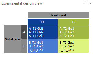
Experimental design view
The experimental design view shows the Experimental design matrix used for your analysis. Its color coding is applied to all other elements on the screen. Note that this view is not available for a Gel analysis.
Plot area
The plot area contains one or several plots. When several plots are available, you can click the corresponding tabs to switch between them. Available plots are:
- Expression profile – Shows, for each sample, the spot abundance (Vol Ratio or Volume on the Y-axis) as dots or bars, as well as the mean value (white horizontal bar) and standard deviation (colored bands) for each treatment group.
- Interactions plots (one for each factor in a 2-factor analysis) – Displays the means and standard deviations for the levels of one factor on the X-axis and has a separate line for each level of the other factor.

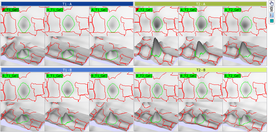
Display area
The default layout of the images in the Display area corresponds to the layout in the Experimental design matrix. The colors let you easily see what treatment conditions you are looking at. At the right of the Display area, you will find the standard Toolbar to manipulate the image views, and set the visualization options.
Results table
The Results table can be found at the bottom of the screen. It summarizes the results for your specific analysis.
Very importantly, the Results table allows you to:
 Filter by values
Click the Filter by values icon to apply various selection criteria to your spots. You could, for instance, select all spots with an ANOVA probability < 0.001 and a maximum Fold change > 2. Read more about report filters.
 Annotate
Create and combine spot sets, or annotate spots.
Validate spots
When you systematically review spots (for instance spots sorted in a column, or belonging to a spot set) you can validate the spots. This means that you confirm that a spot is, or is not, of interest. A validation column has a tick box that can be in three states:
 – The spot is confirmed as being of interest.
 – The spots is confirmed as not being of interest.
 – The spot has not yet been reviewed and validated.
Spots can be validated at two levels:
- You can validate spots for the current analysis. Do this by using the Analysis-ID column in the results table. Note that although you can display Analysis-ID columns from other analyses in the current results table, you will only be able to edit the Analysis-ID column for the current analysis.
- You can validate spots for the total experiment. Do this by using the Validation column. Note that you can display the Analysis-ID columns from all analyses in one results table during final review.
Click the Settings icon in the Results table to show or hide validation columns.
Note that you can combine the results from several validation columns exactly as you would combine spot sets. Just select the validation columns as Inputs in the Combine Spot Sets window.
Perform a Gel analysis
This type of analysis lets you investigate protein expression within a set of gels, without taking treatments into consideration.
In the Group table, you can sort and filter spots based on descriptive statistics measures such as:
- Mean
- Standard Deviation (SD)
- Coefficient of Variation (CV)
- Range ratio – Highest spot abundance value divided by the lowest spot abundance value in the set of gels.
You can click the Spot table icon in the Group table toolbar to display the Spot table.
Perform a One-factor analysis
This type of analysis – also called one-way analysis of variance or one-way ANOVA – lets you find significant protein expression changes between different levels of a single factor. When comparing two treatment groups, ANOVA gives the same results as Student’s t-test.
ANOVA is a collection of statistical models and their associated estimation procedures. While we summarize the principles below, its comprehensive description is beyond the scope of this user guide. We refer to our list of references for further exploration of the subject.
Principles
In a one-factor analysis, one-way ANOVA is used to test the null hypothesis that the factor under study has no significant effect on protein abundance and so the treatment groups have identical means. It generates a probability value (p-value) that answers this question: If the null hypothesis is true, what is the probability of observing a difference as large or larger between sample means in an experiment of this size, for populations that in reality have the same mean?
If the probability is small, you can conclude that the difference is not likely to be caused by random sampling and assume instead that the treatment groups have different means.
The p-value is often compared to a significance level, which is a fixed probability of wrongly rejecting the null hypothesis if it is true. Usual significance levels are 0.05, 0.01 or even 0.001. For instance, if the significance level was set to 0.05 and the statistical test returns a p-value of 0.0014 (<0.05), then the null hypothesis should be rejected.
Note that the significance level is also the probability of rejecting the null hypothesis wrongly (type I error, also known as false positive finding). By chance, a percentage of all test cases falsely reject the null hypothesis. This is why the significance level should be as small as possible, to protect the null hypothesis and prevent the investigator from inadvertently making false claims.
For example, in an experiment where 1000 p-values are generated (for 1000 protein spots) and a significance level of 0.05 is applied, one can expect 1000 * 0.05 = 50 test cases that falsely reject the null hypothesis due to stochastic changes. For a significance level of 0.001, this would only be 1000 * 0.001 = 1 test case.
Note that the p-value calculated will indicate if the mean of the treatment groups are significantly different or not. It does not indicate between which groups (when there are more than two) the difference was significant. A Multiple Comparisons test is needed to investigate this. Melanie does not currently include such test.
Please note that the ANOVA calculations use the experimental design information such as blocking or subject (repeated measures) factors.
Finding significant protein expression changes
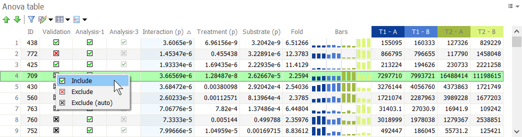
To identify proteins that show significant expression changes between treatment groups, you can sort the proteins in the Anova table based on the p-value for the ANOVA test – Anova (p) – and select those spots with a p-value smaller than your chosen significance level (e.g. 0.001).
You may add further constraints to select proteins of interest, such as the Fold change. It is calculated as the maximum ratio between any two treatment groups. In other words, it is the ratio between the treatment with the highest mean value and the treatment with the lowest mean value. It is common to select spots with Fold > 2, for instance, to identify those proteins for which treatment causes at least a two-fold spot abundance increase or decrease.
To combine spot selection criteria, use Filter by values in the Anova table.
Related reports
You can click the Tables icon in the Anova table to display a number of related tables and views:
- Spot table – Displays a table with the different spot quantities for each spot in each image.
- Expression ratio table – Displays a table with the expression ratios for all treatments, relative to a selected reference treatment.
- Values summary – Displays the quantification value for the selected spot in all images, in the same arrangement as the Experimental design matrix.
- Anova summary – Displays a detailed output of the ANOVA results.
References
For more information about one-way ANOVA, we recommend the following references, articles and videos. Melanie’s calculations are based on the three first sources.
- Glantz, S. and Slinker, B. Primer of Applied Regression and Analysis of Variance 2nd Edition, McGraw Hill, 2000
- van den Berg, R. G., SPSS Tutorials – One of the most visited websites about SPSS and statistics
- Lowry, R., Concepts and Applications of Inferential Statistics, Chapters 13, 14 and 15 – Free, full-length, and occasionally interactive statistics textbook
- How to Calculate and Understand ANOVA F Test published by statisticsfun – Video tutorial on how to calculate, understand and interpret a one-way ANOVA test
- Finding the P-value in One-Way ANOVA published by jbstatistics – Video explaining how the p-value is found
- What is a p-value? published by Jim Grange – Video providing a brief conceptual understanding of what a p-value is
- H. J. Motulsky, GraphPad Statistics Guide. Accessed 6 August 2021 – Excellent introduction to the principles of statistics
Perform a Two-factor analysis
This type of analysis – also called two-way analysis of variance or two-way ANOVA – lets you find significant protein expression changes between different treatments of a two-factor analysis. It examines the influence of two factors on protein abundance. In addition to assessing the main effect of each factor, two-way ANOVA also evaluates if there is any interaction between them.
As earlier indicated in the section about one-factor analysis, the comprehensive description of ANOVA is beyond the scope of this user guide. You can consult this list of references for further exploration of the subject.
Principles
Two-way ANOVA is an extension of one-way ANOVA and therefore similar principles apply. It tests three null hypotheses:
- Factor A will have no significant effect on protein expression
- Factor B will have no significant effect on protein expression
- Factor A and Factor B interaction will have no significant effect on protein expression
For each of these, a p-value is calculated that can be compared against a chosen significance level to decide whether the null hypothesis should be rejected or not.
To interpret the results, the first step is to check whether or not the interaction Factor A x Factor B is significant. If it is, only the interactive effect of the two factors is considered and the two main effects are not considered. The interpretation of the data is that Factor A will behave differently at each level of Factor B. In other words, the effects of Factor A and Factor B cannot be separated. If on the other hand, the interaction is not significant, then the effect of Factor A or Factor B are independent and can be analyzed independently.
Please note that the ANOVA calculations use the experimental design information such as blocking or subject (repeated measures) factors.
Finding significant protein expression changes
To identify proteins for which expression is significantly modulated by one of the two factors you are studying, or by the interaction between those factors, you can sort the proteins in the Anova table based on the different p-values for the ANOVA test – indicated Interaction (p), FactorA (p), FactorB (p).
If the value in the Interaction (p) column is lower than your chosen significance level, you can conclude that the interaction between Factor A and Factor B has a significant effect on protein expression. If Interaction (p) is not significant, then you can analyze Factor A and Factor B independently by looking at their p-values.
You can use the interaction plots to help you interpret your test values. If the lines in an interaction plot are parallel, this means that no interaction occurs between the two factors. If the lines are nonparallel, an interaction occurs. The more nonparallel the lines are, the greater the strength of the interaction.
You may add further constraints to select proteins of interest, such as the Fold change. It is calculated as the maximum ratio between any two treatment groups. In other words, it is the ratio between the treatment with the highest mean value and the treatment with the lowest mean value. It is common to select spots with Fold > 2, for instance, to identify those proteins for which treatment causes at least a two-fold spot abundance increase or decrease.
To combine spot selection criteria, use Filter by values in the Anova table.
Related reports
You can click the Tables icon in the Anova table to display a number of related tables and views:
- Spot table – Displays a table with the different spot quantities for each spot in each image.
- Expression ratio table – Displays a table with the expression ratios for all treatments, relative to a selected reference treatment.
- Values summary – Displays the quantification value for the selected spot in all images, in the same arrangement as the Experimental design matrix.
- Anova summary – Displays a detailed output of the ANOVA results.
References
For more information about two-way ANOVA, we recommend the following references, articles and videos. Melanie’s calculations are based on the three first sources.
- Glantz, S. and Slinker, B. Primer of Applied Regression and Analysis of Variance 2nd Edition, McGraw Hill, 2000
- van den Berg, R. G., SPSS Tutorials – One of the most visited websites about SPSS and statistics
- Lowry, R., Concepts and Applications of Inferential Statistics, Chapter 16. Two-Way Analysis of Variance for Independent Samples – Free, full-length, and occasionally interactive statistics textbook
- Two Way ANOVA (Factorial) playlist published by statisticsfun – Series of 4 video tutorials on how to calculate, understand and interpret a Two Way ANOVA also known as Factorial Analysis
- Finding the P-value in One-Way ANOVA published by jbstatistics – Video explaining how the p-value is found. It does so for a one-way ANOVA, but the principle is the same for two-way ANOVA
- Statistics Lectures playlist published by Jim Grange – Series of 2 very accessible video tutorials: one explaining the Main effects and Interactions using an interaction plot, while the second provides a brief conceptual understanding of what a p-value is
- H. J. Motulsky, GraphPad Statistics Guide. Accessed 3 September 2018 – Excellent introduction to the principles of statistics
Perform a Principal Component Analysis (PCA)
Principal Component Analysis (PCA) is a data reduction technique. It allows to summarize and to visualize the information in a data set consisting of observations described by many inter-correlated quantitative variables. Since each variable can be considered as a different dimension, it is easy to understand that data sets with more than three variables are very difficult to represent.
PCA captures the variance in many variables in a smaller number of new variables or dimensions – called principal components (PCs) – that explain most of the variance observed. By plotting the PCs instead of the original variables you obtain a simplified graphical representation of your multidimensional data.
You can use PCA to:
- Identify image or spot outliers in your data.
- Check whether your gel images cluster according to your experimental design groupings.
- Find proteins that have similar expression profiles.
- Get rough estimations on which proteins are up- or down-regulated in specific image clusters.
Principal component analysis is an advanced statistical technique, whose comprehensive description is beyond the scope of this user guide. You will find more information on the subject in the list of References.
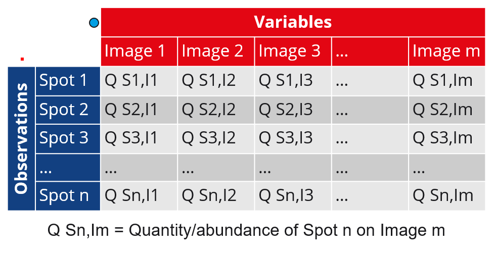
Variables and observations
PCA aims to find the principal components that best discriminate the variables based on the observations. When creating a new PCA analysis, you can therefore choose which of the gel images or spots you want to consider as the observations:
- Images as observations (Spots as variables)
- Spots as observations (Images as variables)
The nuances of the two options are summarized in the following table. Continue reading below the table to learn more about the PCA screen, specific settings and examples of how results can be interpreted.
| Images as observations | Spots as observations | |
| Data table | 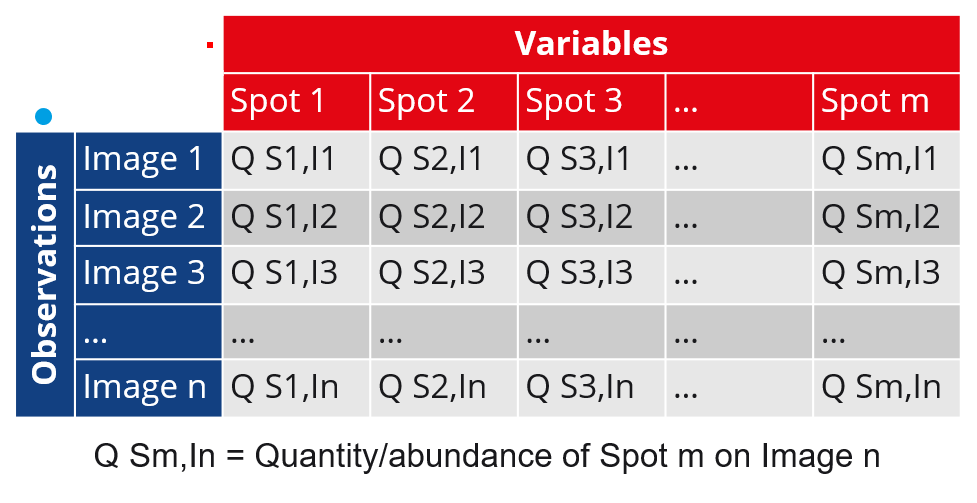 |
 |
| Observations | Images (represented as big colored dots) | Spots (represented as tiny red squares) |
| Variables | Spots (represented as tiny red squares) | Images (represented as big colored dots) |
| Use | You consider each image as a sample from your data set that is described by the abundance of a certain number of spots in that image. As the PCs are built on the observations – the images in this case – this option allows to better discriminate between the images. So generally speaking, it is the most appropriate choice to identify image outliers. | You consider each spot as a sample from your data set that is described by the abundance of the spot in a certain number of images. As the PCs are built on the observations – the spots in this case – this option allows to better discriminate between the spots. So generally speaking, it is the most appropriate choice to identify spot outliers. |
| Variable correlation | Positively correlated spots are grouped together. Negatively correlated spots are positioned on opposite sides of the plot origin (opposed quadrants) | Positively correlated images are grouped together. Negatively correlated images are positioned on opposite sides of the plot origin (opposed quadrants) |
| Quality of representation of variables | The distance between spots and the origin measures the quality of the spots on the plot. Spots that are away from the origin are well represented on the plot and are more important to interpret the two PCs displayed. Spots that are close to the centre of the plot contribute less to the PCs displayed. If a spot would be perfectly represented by the plot’s PCs, it would be positioned on the circle of correlations. | The distance between images and the origin measures the quality of the images on the plot. Images that are away from the origin are well represented on the plot and are more important to interpret the two PCs displayed. Images that are close to the centre of the plot contribute less to the PCs displayed. If an image would be perfectly represented by the plot’s PCs, it would be positioned on the circle of correlations. |
| Observation correlation | Images that are similar are grouped together on the plot. | Spots that are similar are grouped together on the plot. |
| Relation between observation and variable on biplot | An image that is on the same side of a given spot has a high value for this spot; an image that is on the opposite side of a given spot has a low value for this spot. | A spot that is on the same side of a given image has a high value for this image; a spot that is on the opposite side of a given image has a low value for this image. |
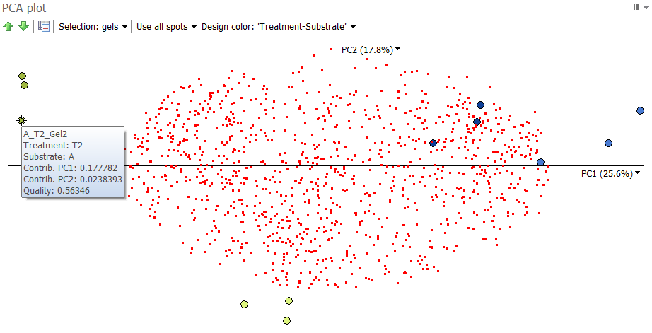
PCA plot
The created PCA analysis appears in a new tab with the PCA plot at the top left. It always displays spots as tiny red squares and gel images as colored dots. To identify each spot or image, you can hover over the item to display a tooltip with the spot ID or image name, and additional information.
Show or hide the variables
Instead of showing both observations and variables in the PCA plot, you can display the observations only. Click the Options icon at the top right of the PCA plot, choose Display and then toggle the option Display variables.
Choose image colors
The colors of the image dots correspond to those of your main experimental design. You can change those colors by clicking the Design color drop down arrow at the top of the PCA plot. Select Choose design color and pick the desired experimental design. The images in the Display area will be grouped according to this choice.
Principal component selection
By default, Melanie displays the plot for the two principal components (PC) that explain most of the variance in the data set. You can change a principal component by clicking the black drop down arrow next to its name. The percent variance for which the component accounts shows between parentheses. The proportion of the variation explained by each calculated principal component is also provided in the Principal component table. To display this table, click the Principal component table icon in the PCA plot toolbar.
Choice of spots used
PCA is initially performed on all spots in the data set. But you can construct the PCA plot on a subset of spots, such as the significantly differentially expressed proteins from your one- or two-factor analysis. Click the Spots drop down arrow at the top of the PCA plot and choose the desired option (Use all spots, Use spot set, Use validated spots).
Zoom in and out
You can zoom in and out of the plot using your mouse scroll wheel. Hold the scroll wheel and drag to translate the plot. You can center again on particular elements by clicking the Options icon at the top right of the PCA plot, choosing Display and selecting one of the Zoom options (Zoom on observations and variables, Zoom on observations, Zoom to view all).
Select spots or gels
By default, the spots are selectable on the plot: click a red square to select the corresponding spot on the images. To select several spots, hold the Ctrl or Shift keys during the selection, or draw an area over several spots. Alternatively, you can make the gels selectable by clicking the Selection drop down at the top of the plot and choosing Selection: gels. Selections are synchronized across all analysis tabs and workflow steps. You can therefore switch to another analysis for more in-depth investigation of particular spots or images, or to the Alignment step to fix possible alignment issues.
Standardization
When using raw data, PCA tends to give more emphasis to those variables that have higher variances than those variables that have very low variances. In the case of spots with several orders of magnitude of protein expression, this is usually not desired. You probably wish each protein spot to receive equal weight in the analysis. This is done by standardizing the variables before principal component analysis is carried out. Standardization consists of:
- subtracting the mean from the variable, to center the data,
- and then dividing it by its standard deviation, to scale the data.
Melanie always centers the data. By default, it also scales the data. You can change the default behavior by clicking the Options icon at the top right of the PCA plot, choosing Display and selecting Use standardized values. This deactivates the option so that no scaling is carried out; the data is only being centered. You can click Use standardized values again to reactivate scaling.
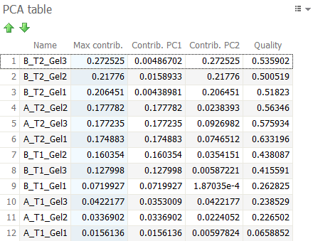
PCA table
The position of the observations on the PCA plot corresponds to their contribution to the construction of the principal components displayed. The further away an observation is from the origin of a principal component axis, the more the observation contributed to this particular component. The PCA table displays the contribution (Contrib.) of each observation to the two principal components displayed in the PCA plot.
The Quality parameter in that table measures whether the projection of the observation is well represented by the two principal components. It tells you how close the distance of the projection is to reality. Observations with very similar behavior (such as images with similar protein expression profiles) are close in space. However, when projected onto a two-dimensional subspace, observations that are actually far apart may appear close together. It is therefore important to look at the Quality to judge whether observations are effectively close. If Quality is high for both observations, the chance is great that they are indeed nearby and have a similar behavior. If one of the observations has a low Quality value, any interpretation becomes tentative.
Principal component table
The Principal component table summarizes, for each principal component (PC), the proportion of variation (%Variance) in the data set that it accounts for. It also gives the coefficients that describe the contribution of each variable to the component.
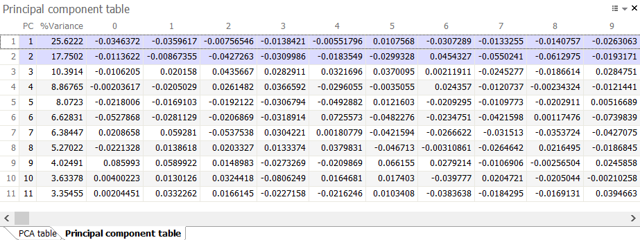
Normally, the number of principal components equals the number of variables being analyzed (images or spots, depending on the option chosen). But Melanie only calculates a limited number of components (together accounting for more than 99% of variance), since much of the variance is covered by the first principal components.
Interpretation of a PCA plot
The PCA plots in Melanie represent the observations and variables in the same biplot. However, the scales used in each of the two representations are not the same. You therefore cannot draw any conclusions from the proximity of spots and images in the plot. You should only consider relative direction and distance from the axis origin.
To clarify how this works, we can look at an example from a two-factor analysis. Bacteria grown on two different substrates (A and B) underwent two different treatments (Treatment 1 and Treatment 2). Three replicate samples were run for each of the four conditions. A two-way ANOVA analysis was carried out to identify the significantly differentially expressed protein spots (called “significant spots” below), either for the Treatment factor, the Substrate factor or the Interaction between these two factors (p values < 0.001).
We then create two PCA analyses:
Images as observations
The following plot is obtained when images are taken as observations and spots as variables. Only significant spots are considered in the analysis.
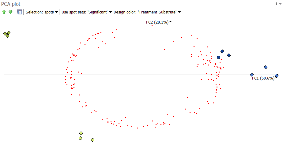
We can see that the images from the same condition cluster together, in line with the experimental design groupings. If this had not been the case, further investigation would be needed to explain any image outliers. Note that PCA is more likely to cluster images according to their groups when you only use significant spots. This makes sense, as PCA captures variation and significant spots show high variation.
We would also hope to see the expected groupings when considering all spots in the analysis, as an even stronger indication of the presence or absence of image outliers. When considering all spots in the analysis, this is the plot we get:
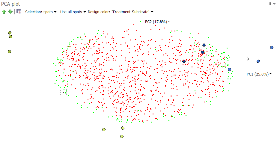
The images of the same group still cluster together, though with a little more dispersion. This is not surprising, as we not only consider the significant spots (in green) but also the spots with little variation (in red).
We see that the significant spots are furthest away from the origin of the plot, i.e. the (0,0) position were the two axes cross. The further away a spot is from the origin, the more likely it differentiates between the images.
Spots clustering together on the PCA plot have similar protein expression profiles. This can be seen in the illustration below. It shows the expression profiles for five distinct spot clusters. For instance, the spots 425, 331, 438, 653, 298, 283, 362 and 651 are all highly expressed in the group Treatment 2 – B, but have much lower abundance in the three other treatment groups.
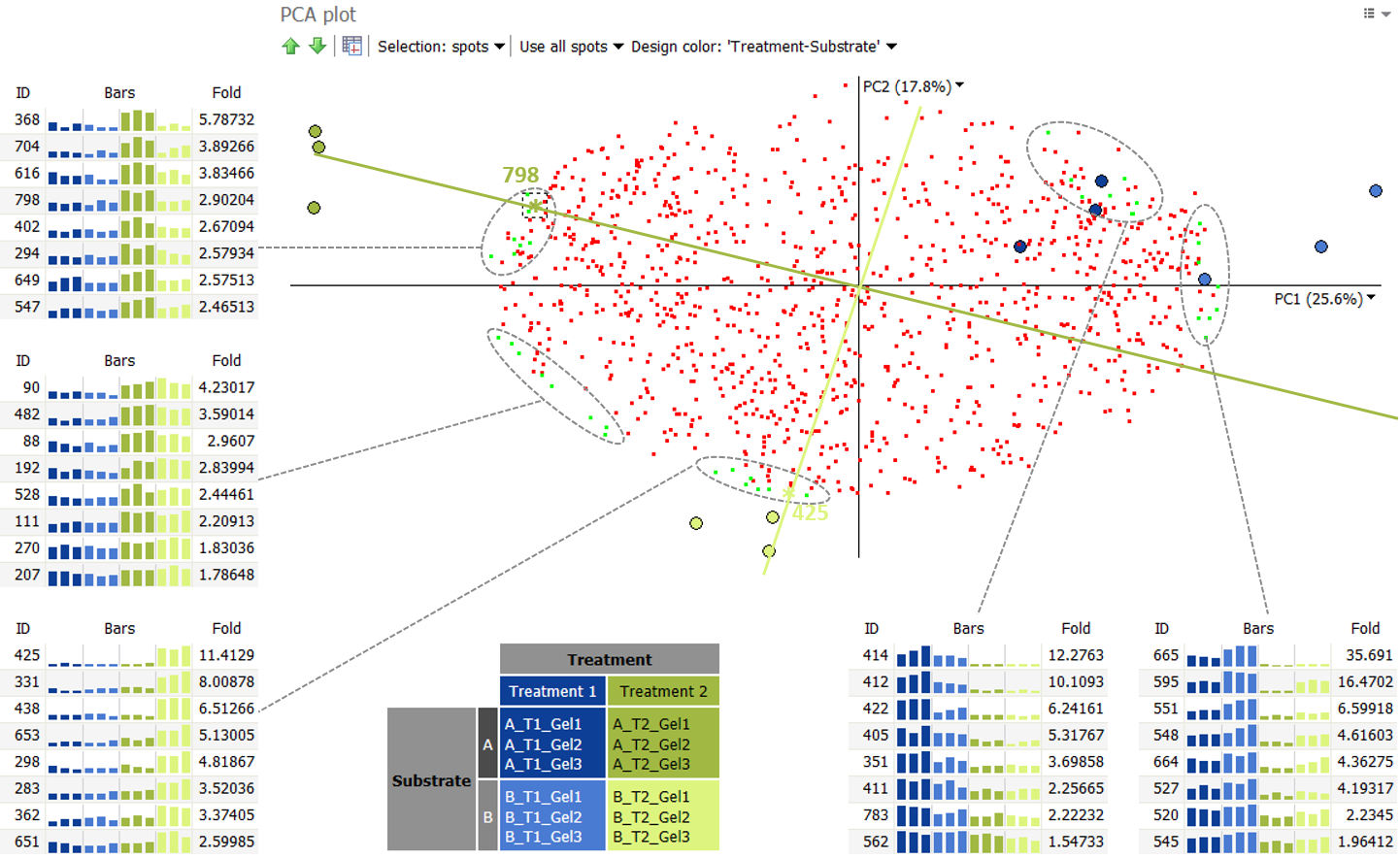
We can take a closer look at spot 425 in that cluster. We can draw a “spot axis” through the spot and the origin (0,0). Images on the positive side of this axis, i.e. in the lower part of the plot, will have high abundance values for this spot. This is the case for the images of Treatment 2 – B. On the other hand, images on the negative side of this axis, i.e. in the upper part of the plot, will have low abundance values for this spot. This is what we see for the three other treatment groups, when looking at the spot’s protein expression profile.
It is important to understand that the position of an image in the PCA plot is determined by all spots considered in the analysis. But the closer an image is to a particular “spot axis”, the higher the influence of the spot is for the position of the image. So spot 425 and the other spots in the same cluster highly contribute to the positions of the images B_T2_Gel1, B_T2_Gel2 and B_T2_Gel3. Similarly, spot 798, and the spots 368, 704, 616, 402, 294, 649 and 547 highly contribute to the positions of the images A_T2_Gel1, A_T2_Gel2 and A_T2_Gel3. As shown in their expression profiles, these protein spots are more abundant in Treatment 2 – A then in the other groups.
Spots as observations
In a second analysis, shown below, we consider the significant spots as observations, and the images as variables. We can first note that although PC1 accounts for 83% of the variation, it does not account well for the differences between experimental groups. In fact, PC1 often correlates with protein abundance. Indeed, from the 158 significant spots considered in the analysis, the 20 most abundant protein spots (mean volume) are shown in green.
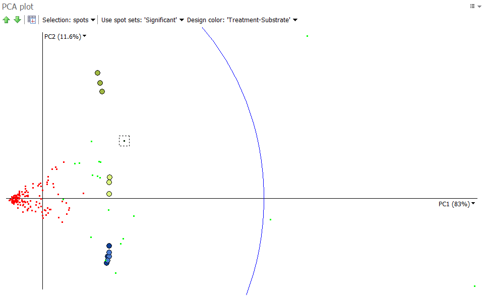
We can therefore look at the second and third principle components, as shown below. Again, when we draw an “image axis” through A_T2_Gel3 and the origin (0.0) we note that spots close to this axis are highly abundant in A_T2_Gel3 and the other two images in the same group, exactly as observed in the Images as observations analysis.
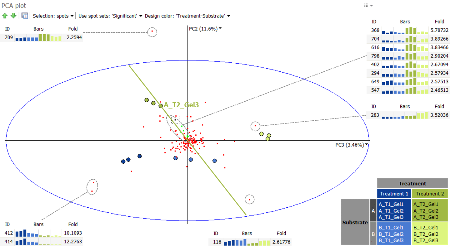
This PCA plot shows some spot outliers, such as spots 709, 283, 116, 412 and 414. Such outliers can either be very strongly differentially expressed proteins, or mismatched spots. When spots appear mismatched in the Display area, you can jump back to the Alignment step to correct the alignment, before continuing further analysis.
References
For more information on PCA, we recommend the following articles:
- Powell, V.; Lehe, L. Principal Component Analysis explained visually (accessed August 4, 2021).
- Dallas, G. Principal Component Analysis 4 Dummies: Eigenvectors, Eigenvalues and Dimension Reduction October 30, 2013 – Explanation of the principles of PCA, without a single equation.
- Lebart, L., Morineau, A., Piron, M. “Section 1.2 – Analyse en Composantes Principales” Statistique exploratoire multidimensionnelle, Paris: Dunod, 1995. 32-66
- Kassambara, A. PCA – Principal Component Analysis Essentials – Articles – STHDA (accessed August 4, 2021)
- PennState Eberly College of Science, STAT 505 – Applied Multivariate Statistical Analysis online course, Lesson 11: Principal Component Analysis (PCA)